I fixed the painting so that I would not get any mixing of the pastels when I applied further colours, etc and went back in with a lighter blue to remove the clouds. You can see traces of them but that does not worry me. I repainted the tree and its branches and this time added a lighter edge to the main trunks / branches. It was quite a dark brown buut of course against the black it showed up relatively light.
Next step was to emphasise the foliage at the bottom of the painting. I used an olive green (again it looks lighter than it was) and a smaller area of a dark hookers green (ish!) to paint in a textured undergrowth.
I am now very pleased with the result. Zazzle here I come!
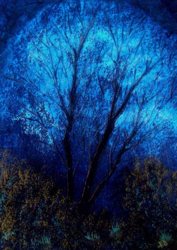
It does not show up too well in the photograph (probably taken too early in the morning as I was in a hurry- and may try to get a better photo) but there is a very good 3-D effect between the foliage, the lower trunks and the general background.
This shows better in a photoshopped copy of the image:

Much happier now and I will be putting this onto Zazzle where prints / poster / cards of the image may be obtained; more details later in the week for those (if any?) who might be interested.
No comments:
Post a Comment